

Before we get into how to write scannable content, I want to talk about behaviour… Your behaviour… Your customers’ behaviour… My behaviour.
We used to sit down and read books in our downtime. Now we ‘consume content’ all the time. We’re constantly reading, listening, searching, subscribing, and sharing and we’re doing it in bed, on the bus, in between appointments; or while we’re working, watching TV or exercising. We’ve become serious multi-taskers (although true multitasking is a fallacy) and we don’t have time to R-E-A-D.
No siree. We’re busy-busy-busy.
So we scan.
I don’t know about you, but when I arrive at a website or blog post, I do a quick scan. Is this what I’m looking for? Will it deliver on the promise? Will it solve my problem? Yes? No. Click. Gone.
I have 8-10 tabs open at the same time and I’m looking for reasons to narrow my search. The Nielsen Norman Group tell us that most website visitors decide to stay or go within 10 to 20 seconds. I usually decide in less than 5 seconds—and that’s being generous.
This is what your copywriting is up against. It’s competing with other businesses, but it’s also competing with my phone, my social media, my dog, my kids, my growling belly and the telly. If you want to come out on top your content has to:
1) Offer real value
2) Make sure that value is understood, VERY quickly.
Here’s the point:
To make sure someone can quickly grasp the value you offer, you need to have scannable content that’s eye-catching and easy to read.
That’s where clever formatting can help.
Subheadings: Highlight your points
Long, unbroken paragraphs don’t work online. They discourage people from stopping to read.
A subheading is a headline for a section. It lets you group subjects together. Subheadings make it easy for readers to jump to the section that interests them—rather than having to wade through paragraph after paragraph to find something of interest.
Add a subheading every time you shift ideas or make a new point. If you find yourself with more than three or four paragraphs, think about adding another subheading (or an image).
Lists: make them punchy and scannable
From my grocery shopping to my to-do list, I love the focus a list gives me. Done well, lists it easier to grasp a lot of content at once. Much easier than a paragraph of words.
Long lists can be overwhelming though so if you are including lists in your content, limit them to five items or fewer. If you find yourself with a longer list, consider other ways of formatting—or keep each point very brief.
Summarise. For wordy points, include one or two bolded summaries at the start of the list item, with an explanation that follows.
Order your list by priority but put the most important point last. Even if your readers don’t consciously think it, they will assume the last point is the least important. If the least important item is fantastic, their brain notices! WIN.
Consider how the list looks, with the ebb and flow of each point. I often mix up a list based on the length of the points and how they display.
Dots & Dashes: give the eyes a break
- Use parentheses (even when something’s not a side note)
- Separate a string of thoughts… with ellipses… they give the eye a break
- Trade in periods and commas for long, noticeable lines—em dashes—to give a statement a bit more drama and make it stand out
- Replace “and” with an ampersand (“&”) or a plus sign (“+”)
Grammar rules: break them to make words stand out
- Capitalise words that don’t need to be capitalised but Need To Be Read. (This one is always contentious with sticklers for grammar because, of course, you shouldn’t capitalise anything that isn’t a proper noun BUT capitalising can mix it up just enough to keep a reader’s eyes and brain interested)
- Use the numerals 1, 2 or 3 instead of the words one, two or three. Again, not grammatically correct but great in headlines
- Use multiple font sizes across headlines, subheadings, intro paragraphs and main content
-
Put the important copy in a larger font and use whitespace thoughtfully
- Consider spacing between characters (kerning) and lines and paragraphs (leading/ledding). (This usually a design decision not a copy decision)
- Bolding and colouring text will help visitors see what you want them to see. Imagine them ONLY reading ONLY the bolded text
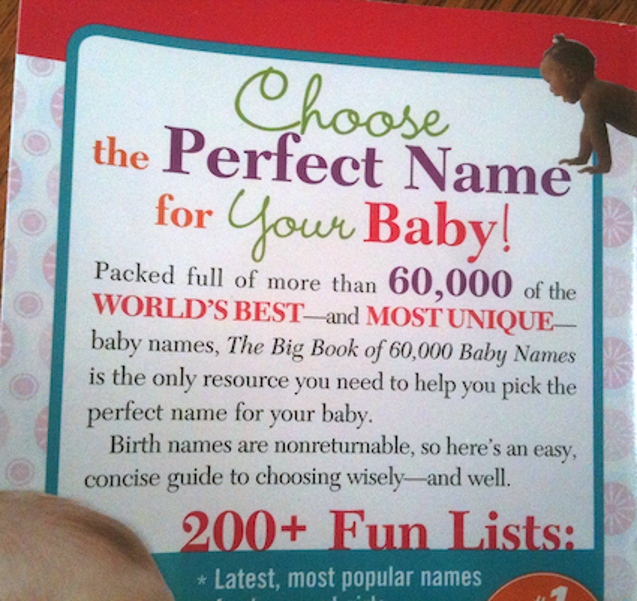
Here are two examples that use some of the techniques I mentioned.

The second one is actually the back of a book and it’s almost too much, but you can see—without actually reading it—what this is about.
Now here are some DON’Ts
- Don’t overdo your formatting. Website copy—or any copy for that matter—doesn’t need to be lit up like Las Vegas. The book cover above is probably about as much formatting as we can take
- Don’t write in ALL CAPS (unless you’re capitalising the word “FREE”, but even then do so sparingly)
- Don’t use excessive exclamation points!!!!
- Dont mispel werds
- Don’t write really long paragraphs
- Don’t be afraid of one-word paragraphs. Or one-sentence paragraphs
- Don’t justify all the text—leave it left aligned. The jagged ebb and flow of the left alignment makes copy easier to read
- Don’t be afraid of the fold. There’s been a lot of talk over the last five years or so that you shouldn’t have anything important past the fold (which is the scroll point on a website). But with so many different devices in use now, the fold is a moving target
If you write compelling copy, people will scroll to read it. You just need to make sure it’s compelling from the first word.
So there you have it. Clever formatting for scannable content.
Have I missed anything? What other formatting techniques do you use? Maybe you have a formatting bugbear that drives you crazy? Go on, spill!
Belinda

16 Responses
I need to get over having more than one sentence in a paragraph. Thanks for sharing these tips, I love them 🙂
When I have just one sentence hanging out there on it’s own, I like to think of it having plenty of breath space to make an impact. It can be a really effective way to make your statement stand out!
Great points as always Belinda!
(Isn’t the info overload exhausting and terrifying)
There are so many appallingly formatted websites out there!
Thanks Charlotte. And yes I completely agree. I just click off immediately but it goes to show that great copy can be completely ruined by crap formatting and design.
Thanks Belinda, wise words, which remind me a bit of Malcom Gladwell’s book Blink.
Thanks for commenting Ross. I didn’t know the book but I googled it and, yeah. The easier we make it for our audience to make decisions without them having to “think” about it, the more we’ll get made in our favour.
I totally agree. I (and everyone else) mostly scan pages. And to add to your point about exclamation marks, I was ranting about this just last week! (!!) http://gidgetmedia.com.au/think-another-exclamation-mark-wont-hurt-think/
Two words. Include videos! Preferably above the fold and on the left 🙂
Hey Camilla, I agree that top left is a great position but what about people who don’t like watching video (like me)? I would definitely prefer to read a blog than watch a video.
Catering for all types is a great approach but that would mean having text and video … and we’re back to making sure the text is scannable.
I find adding images to break the page a great help. But the images must illustrate the point. And be sure to label lists correctly. I’ve seen 17 tips, as example, when the headline said 20! When this happens, I get distracted and start focusing on finding the misplaced tips.
Wow, it’s 10 years already and scannable content is more relevant now than ever. Keep up the great work!